

Goals
Increase the amount of sales made per visitor on their website
Gain the trust of high-profile social influencers on TikTok and other potential partners
Develop a reputation of being a unique and stylish clothing brand by standing out among other Utah companies
Develop basic branding guidelines that can inform the design of their website and other marketing assets
Since Utah is known for having many conservative "boutique" clothing stores and swimsuit brands, Jobee wanted to stand out and speak to a different audience. After a bit of research, we determined that their ideal audience was 16 to 24-year-old women living in Utah who are interested in fashion and fitness. They had been selling swimsuits fairly consistently, but wanted to up their game in preparation for the summer season. They particularly wanted to improve their visual branding across their social media and website, since that is what nearly all of their customers see when making a purchase.
After identifying the target audience, I put together three stylized mood boards to present possible directions we could take the brand. I do this before designing the logo to get a clear idea of what look and feel will work best before worrying about a specific logo.


Daniel and Shelby loved all three options, but felt particularly drawn to option two, Flamingo. We decided that the bolder letters and colors fit their target audience more and would allow them to stand out from their competitors! I used this direction to create a striking, clean look for the brand that works well across many different mediums.
After a bit of finessing, I found a color that was close to what I used in the mood board. I also found that I really liked the simple curved J since it added a bit of character to the wordmark. I typically present multiple logo options, but since we did so much prep work and I was so confident in it, I presented this logo as my recommended solution. And they loved it!


The “J“ from the logo also works as a separate mark that can be used as part of a design or by itself when space is limited.


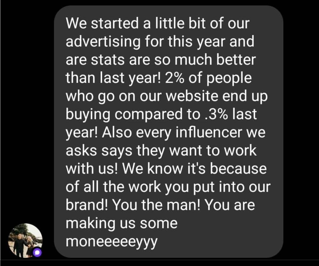
Text I received two months after the project ended. Results!
“We were blown away with how much thought [Gene] put into everything he made. The end product was absolutely perfect. It matched the business’s personality and made it look a lot more professional!”