logo, branding, naming
Monarch Greenhouse Solutions
problem
This Utah company needed help attracting new customers. They also wanted to be seen as knowledgable industry experts and not just a service provider.
solution
Develop a name, logo, and visual identity that conveys a larger vision of sustainability and self-reliance. Also help communicate the function and beauty of greenhouses.
Naming
The client needed help developing a name for their brand. I started by thinking of words related to industry, such as eco, environment, earth, etc. I also brainstormed words that were more unique to their brand, such as words associated with Utah and greenhouses. Once I had a good number of words, I started pairing them together to see if any felt right together.
Names we considered at first included Preservation Pros, Starling Greenhouse, Greenhouse Guru, and Guardian Greenhouses. The client liked them, but felt that none of them felt just right. We decided that—for clarity—it would be best to incorporate ‘Greenhouse Solutions’ as a subtitle.
I presented a few more options, including Wasatch, Emerald, Guardian, and Monarch. Monarch ended up winning, and I think we definitely went with the right choice. The word monarch effectively conveyed a sense of elegance/professionalism, as well as nature and sustainability.
Brainstorming
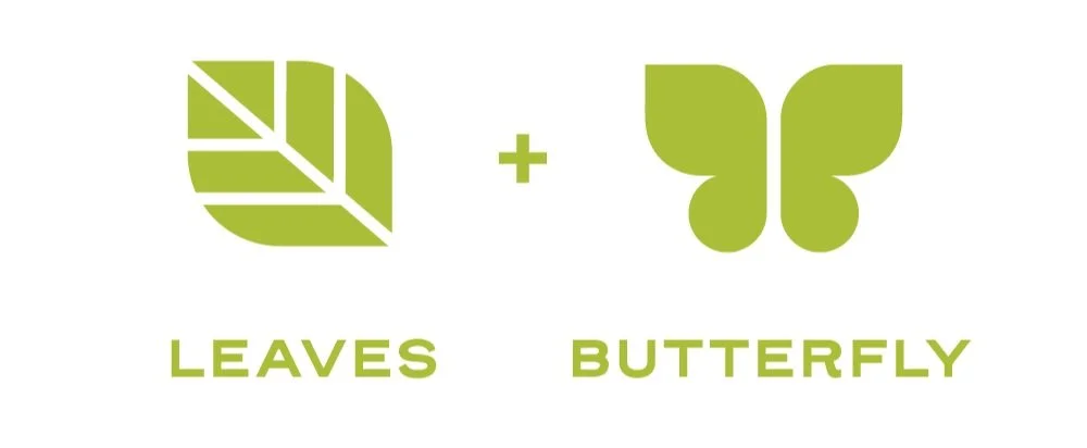
From the beginning, I liked the idea of incorporating the shape of a leaf into the logo somehow. I experimented with a variety of options, but my favorites featured leaves in one way or another. I kept coming back to the shape of butterfly wings, since they were similar to the natural shape of leaves.
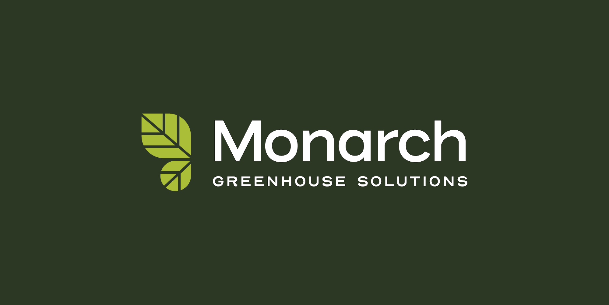
Some iterations worked better than others, but I ended up landing on a concept I was really proud of. It used the shape of two leaves to create half of a butterfly wing span. It subtly implied the shape of a butterfly, which perfectly fit both the brand name and the business itself.
Conclusion
The client was really happy with the finished result. The finished branding is versatile and works in a wide range of situations. They had gone from having no branding whatsoever to having a strong business name and logo. I also developed a brand style guide for them, as well as business cards and a few other digital assets.


